A choice list lets you create a list of group radio buttons. This option type is an input type that allows for selecting only one option value at a time. Instead of typing something in, they simply pick from a list that you create.
It renders as small circles that are filled or highlighted when selected. Please note that it’s impossible to unselect a radio button, it’s only possible to switch between the values.
This is where you create the actual choices your customers can pick from. Each choice can have its own rules.
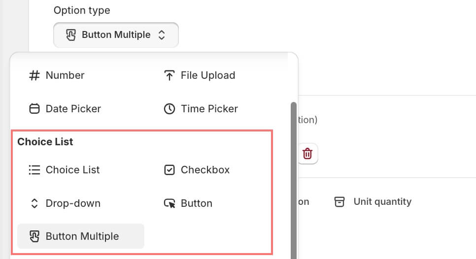
Display Style – Choose how the list appears:
- Button Multiple: allow customers to tap/click buttons to select – can be single or multiple selections depending on your settings.
- Choice list: A simple list of all your choices displayed directly on the page. It allows customers to see all the options at once and pick one.
- Dropdown: This type is a single-choice dropdown selector. It is an expanding menu that allows a client to select one value from a predefined list.
- Radio buttons: Round buttons that let customers select exactly one option. Only one radio button can be selected at a time.
- Checkboxes: allow a client to select none, one, or multiple options. It shows up as a square box that is supposed to be ticked/checked to be activated.
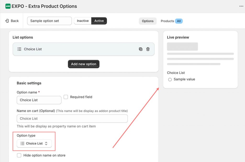
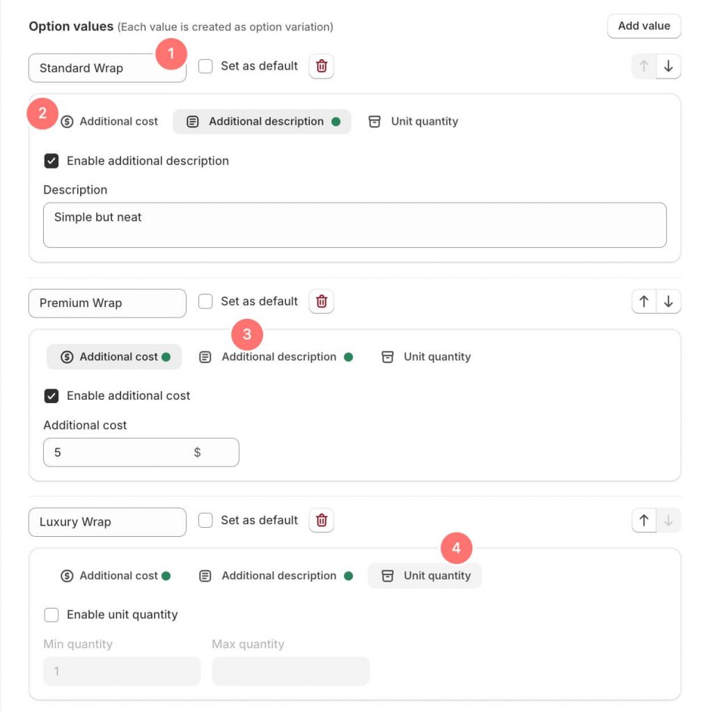
For every option value, you can set:
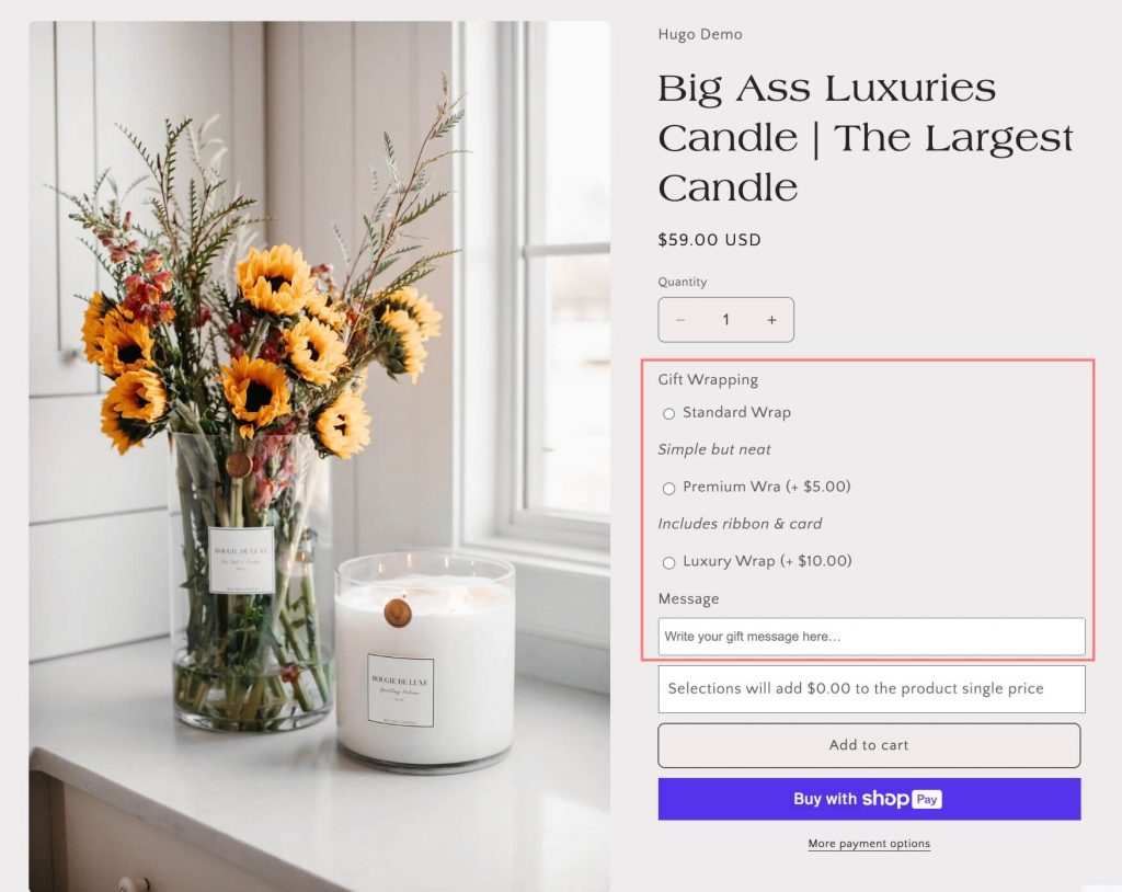
- Choice Name: The label shown to your customer.
- Extra Price (optional): Charge more for premium options.
- Additional Description: A short note to explain the choice in more detail.
- Unit Quantity: Define how many units this choice represents.
Need Help?
We’re here for you!
Reach out to our support team directly from your EXPO dashboard we usually reply within a few hours. Or email us at [email protected] with your store link and a short description of what you need.