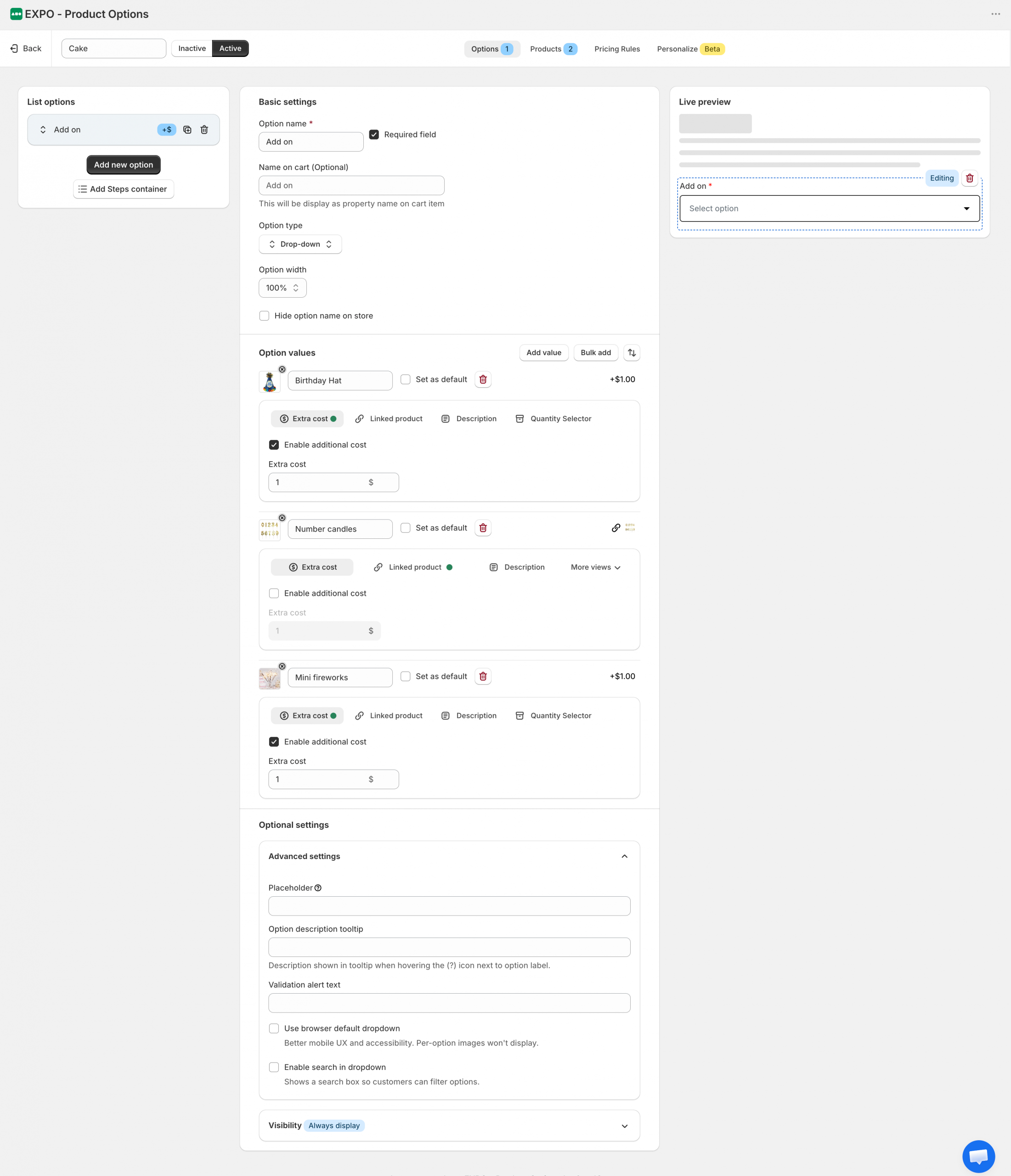
The Dropdown option allows shoppers to select a single value from a list of predefined choices. Available values are displayed in a compact dropdown menu, helping keep the product page clean and organized, especially when there are many options to choose from.
Configuration
After adding a Dropdown option to your option set, you can customize its display, available choices, and visibility settings.
Basic settings
The Basic settings section controls how the option is displayed and identified throughout your store.
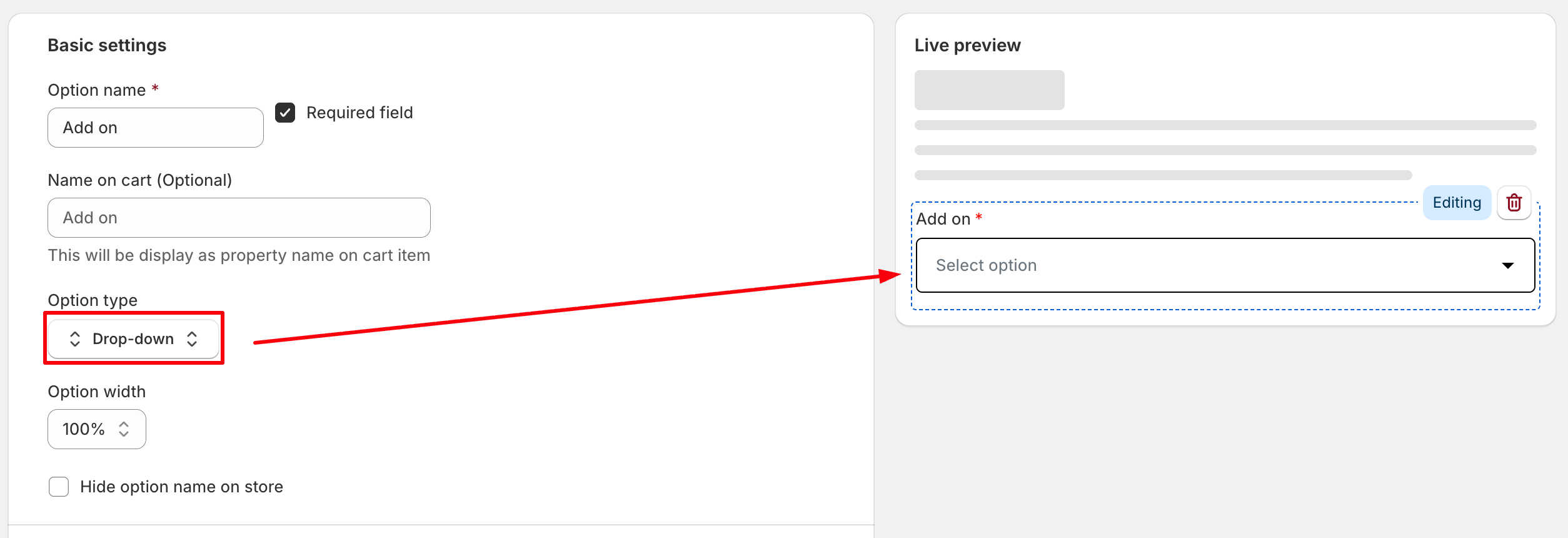
- Option name: The label displayed to shoppers on the storefront.
- Required field: Require shoppers to select a value before adding the product to the cart.
- Name on cart: Customize how this option appears in the cart, checkout, and order details. If left empty, the Option name will be used.
- Option width: Control how much horizontal space the option occupies within the product form.
- Hide option name on store: Hide the option label on the storefront while keeping the dropdown visible.
Option values
Use this section to create and manage the available choices.
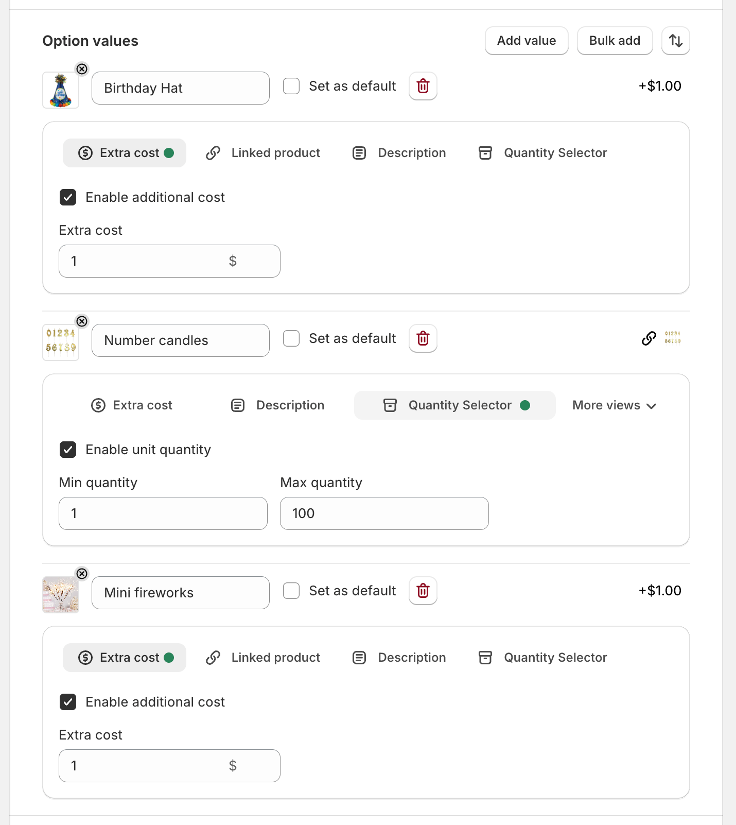
- Add value: Add a new selectable value to the option.
- Bulk add: Create multiple values at once.
- Sort values: Reorder option values using drag and drop.
- Set as default: Automatically select the value when the product page loads.
- Value image: Upload an image for the option value.
- Extra cost: Apply an additional charge when the value is selected.
- Linked product: Associate the value with a Shopify product.
- Description: Add additional information for the value.
- Quantity selector: Allow shoppers to specify a quantity for the selected value.
Optional settings
Expand this section to access advanced configuration and visibility settings.
Advanced settings
Configure additional display and interaction settings.
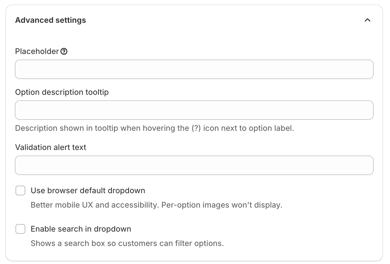
- Placeholder: Display custom text before a value is selected.
- Option description tooltip: Display additional information when shoppers hover over the tooltip icon next to the option label.
- Validation alert text: Custom error message displayed when validation requirements are not met.
- Use browser default dropdown: Display the native browser dropdown instead of the enhanced EXPO dropdown. This can improve mobile usability and accessibility, but option images will not be displayed.
- Enable search in dropdown: Add a search field that allows shoppers to quickly find and filter option values. This is especially useful when the dropdown contains a large number of values.
Visibility
Use visibility rules to control when this option is displayed.
You can show or hide the option based on other option selections or configured conditions.
Frontend display
On the storefront, the Dropdown option displays a list of values inside a dropdown menu.
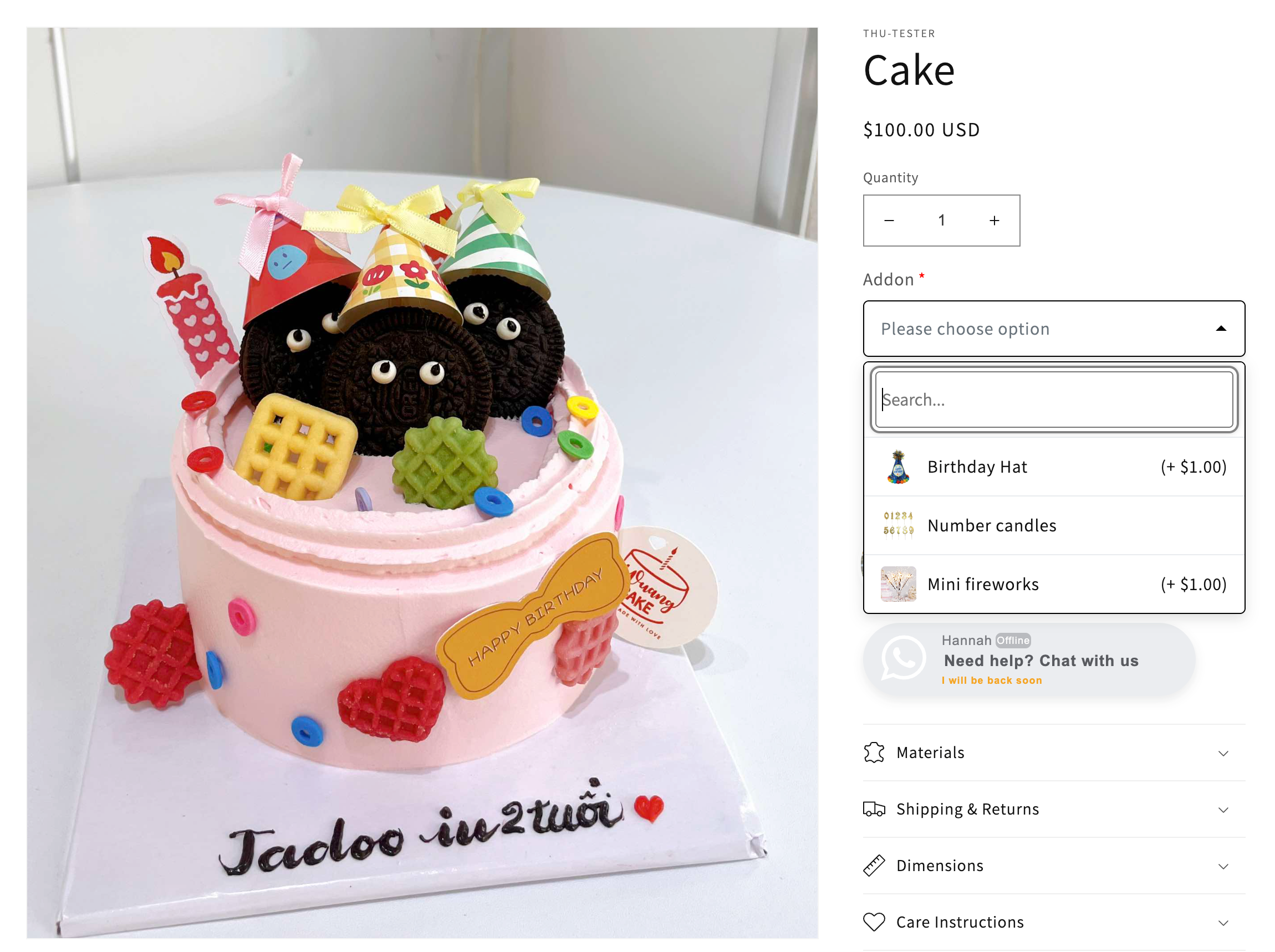
Shoppers can open the dropdown and select a single value. Depending on the option configuration, values may include images, descriptions, additional pricing, or linked products.
If additional pricing is configured, the product price is automatically updated when a value is selected.
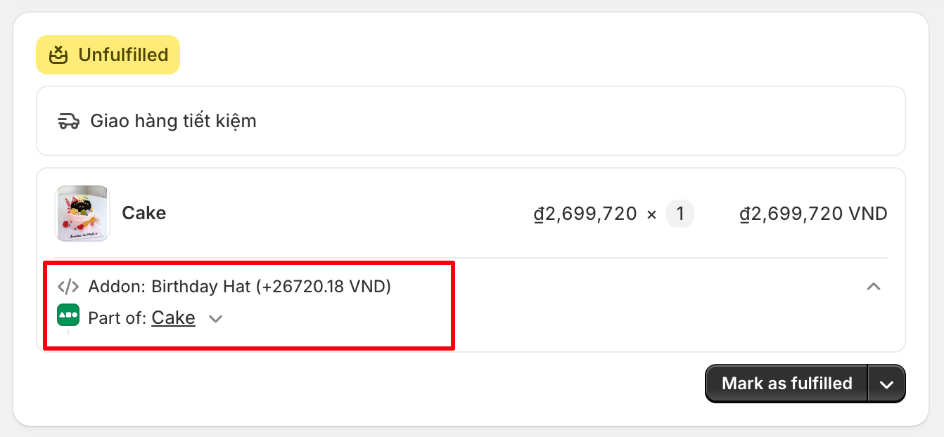
The selected value is saved with the order and remains available throughout the purchasing workflow.
In Shopify Admin, the selected value is displayed in the order details together with other product customization information, allowing merchants to easily review customer selections.
Need Help?
We’re here for you!
Reach out to our support team directly from your EXPO dashboard we usually reply within a few hours. Or email us at [email protected] with your store link and a short description of what you need.
No question is too small – whether it’s your first time setting up an option or you just need a quick tip, we’re happy to help.